Breathing New Life into a Reporting Tool With Targeted Redesigns
Year: 2024
Role: UX Design Lead
The Problem
Imagine opening a toolbox and finding a tangled mess of random tools—some rusty, some shiny, some you didn’t even know were there. That’s what the client’s product complaint and adverse event surveillance tool had become. Over the years, updates were bolted on to meet immediate needs without a grand plan. The result? A labyrinth of duplicated navigation tabs and half-functional features.
Users were stuck in a frustrating scavenger hunt, unsure how to get from point A to point B—or whether “B” even existed. Many features were broken or unintuitive, and morale was hitting rock bottom.
Enter the UX experts. The client wanted a tool that was sleek, scalable, and simple. A design that catered to diverse user personas, streamlined workflows, and made sense—finally. Oh, and no pressure—this would set the standard for redesigning systems across their organization. Challenge accepted.
The Journey
As UX Design Lead, I dove headfirst into the chaos. I juggled stakeholder wrangling, mentored a junior designer, and steered design reviews with all the finesse of a tightrope walker. Every step of this journey was hands-on and high-stakes, and I was ready for it.
Digging Into User Needs
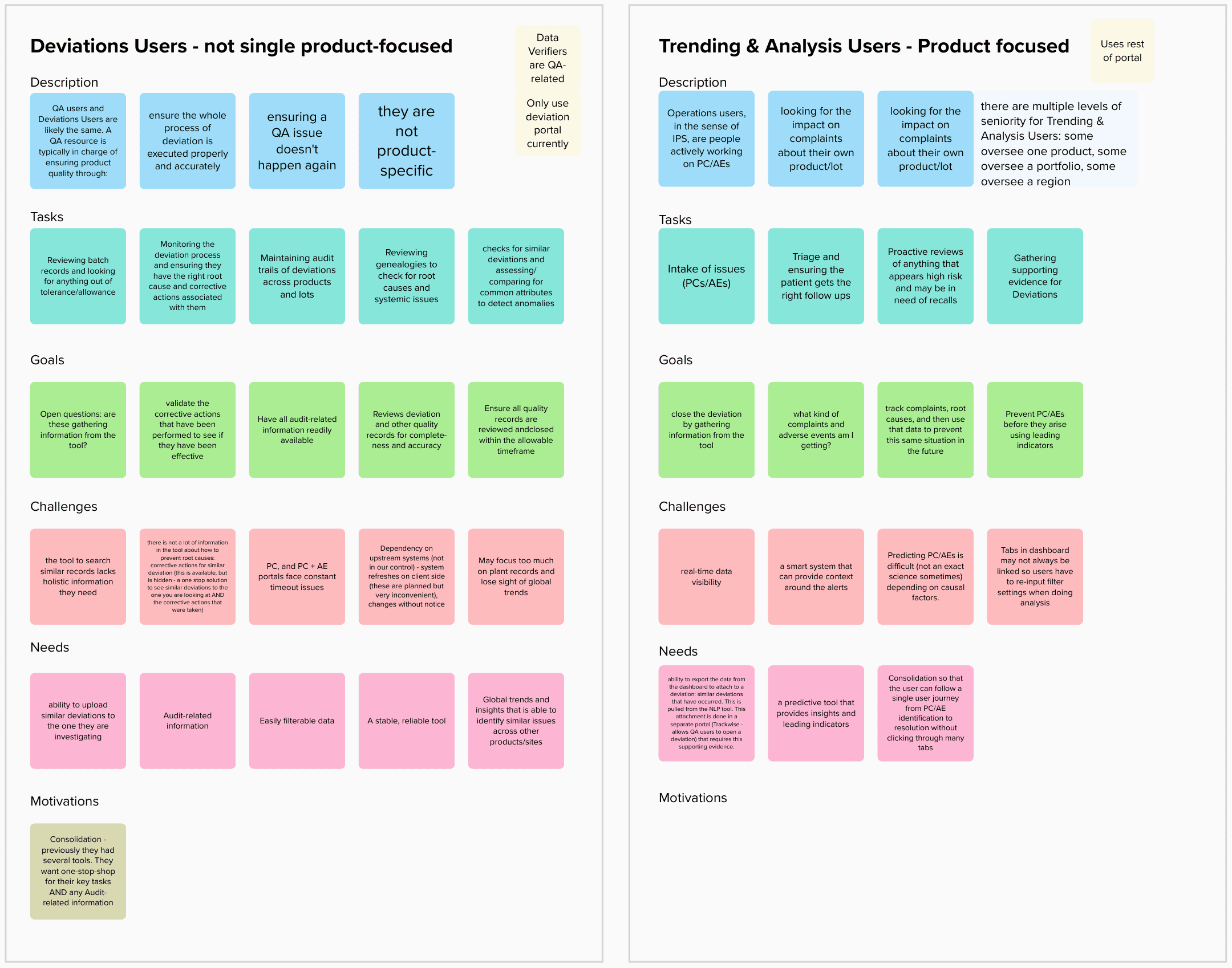
We started by getting to know the users—or at least their world. While direct interviews with deviation and trending analysis users weren’t on the table, we teamed up with SMEs and proxy users to fill in the gaps. These conversations were goldmines of insight.
Deviation users? All about solving anomalies and staying compliant. Trending and Analysis users? Laser-focused on spotting patterns and data management. Two very different mindsets, one very broken tool.
Using Mural, we mapped workflows and uncovered the ripple effects of these challenges on day-to-day tasks. I worked closely with the junior designer to distill these insights into actionable deliverables. Together, we laid the groundwork for a new, task-focused information architecture (IA) that actually made sense.

Finding the Cracks
Next, I put the tool under a microscope with an expert review—and oh boy, it did not hold up. Usability issues were everywhere:
Tasks didn’t align with user workflows, with poor grouping and weak visual hierarchy disrupting the flow.
Key actions were hard to find, buried in redundant portals and scattered sections.
Feedback was lacking, with minimal visual cues or guidance to help users navigate.
Screen layouts were inefficient, with misaligned elements and poor readability.

I ranked these issues by severity and impact, then built a roadmap to tackle the big ones first. One major goal? Navigation.
The old system grouped navigation by user type and access level, creating duplication and chaos. I flipped the script, organizing everything around tasks instead. This cut the clutter, slashed the number of tabs, and made navigating the tool feel like a breeze instead of a chore.

Original IA (with analysis notes)

Proposed IA
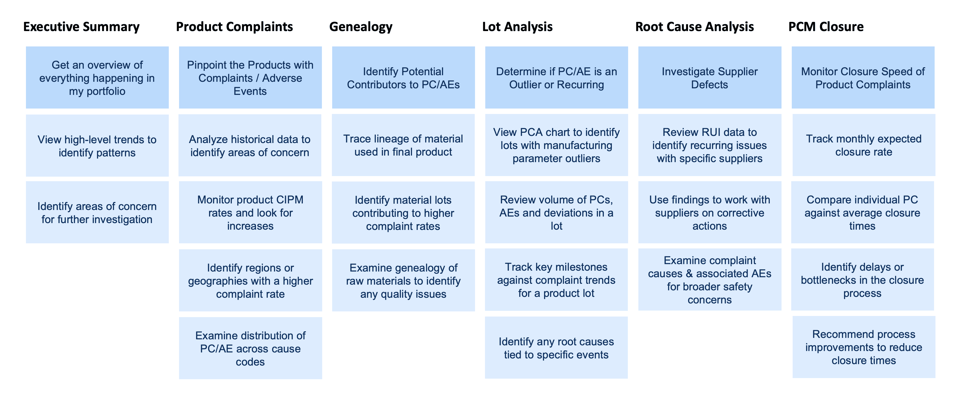
I streamlined the IA from duplicated portals to a task-based structure, making it easier for users to navigate and complete key tasks efficiently.
From Problems to Solutions
Armed with the roadmap, I developed a series of targeted design fixes—or as our client called them, “snippets.” These ranged from reimagined layouts to smarter interactions. In Figma, we brought these ideas to life, with me mentoring the junior designer to ensure every detail was polished and user-friendly.
But this wasn’t just about fixing a tool—it was about empowering the client. I led workshops with stakeholders, demystifying UX principles and showing how thoughtful design could ripple through their entire ecosystem. It was about solving today’s problems while planting seeds for tomorrow.

The Results
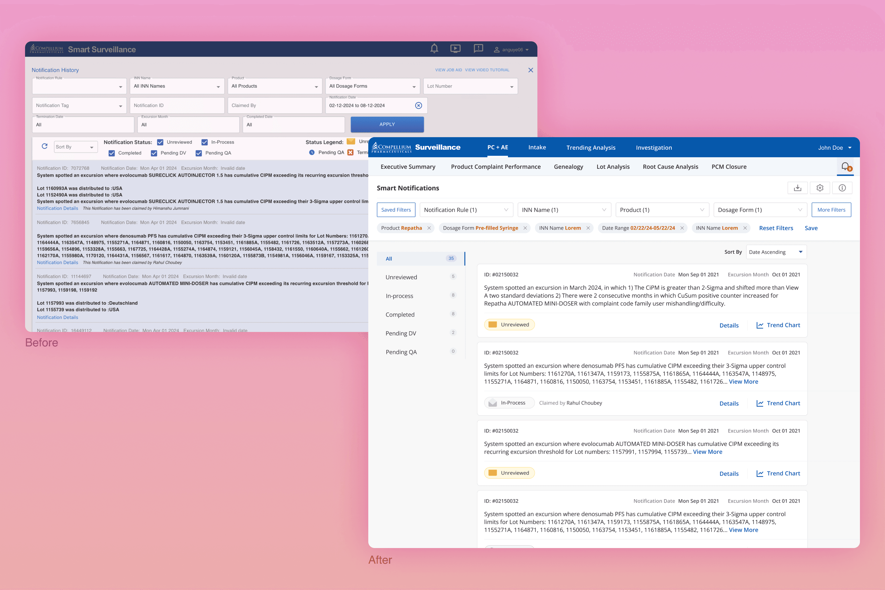
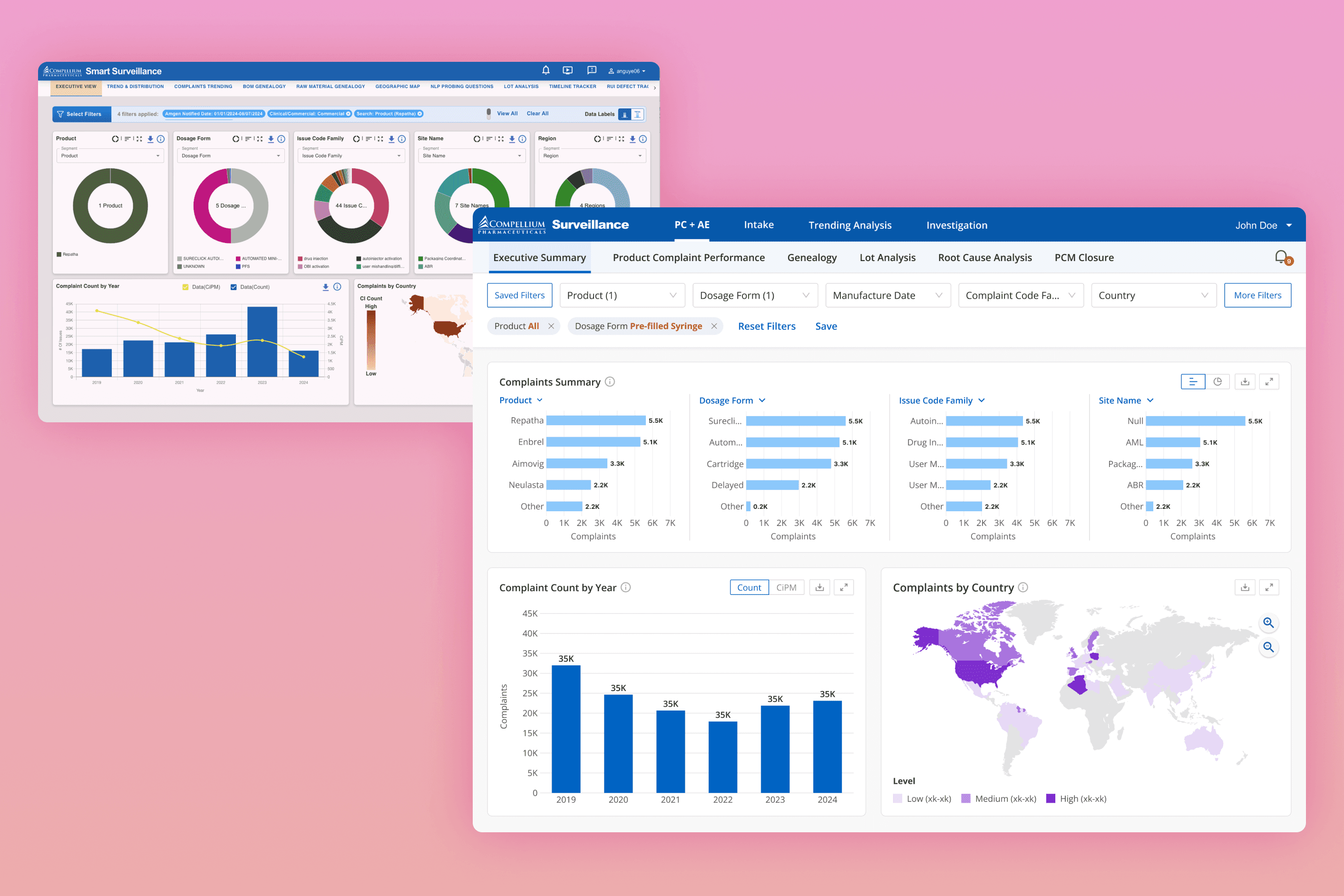
By the end of the project, the tool had been transformed from a chaotic, bloated system into a streamlined, intuitive platform that worked seamlessly for its diverse users. Key improvements included a task-based navigation structure that replaced fragmented, user-type-based tabs, reducing complexity and improving efficiency by an estimated 30%. We introduced centralized global filters, making it easier to find relevant information and reducing repetitive steps. The revamped quality record search, with features like auto-suggestions and dynamic filters, allowed users to locate critical data in seconds instead of minutes.
Smart notifications ensured users received relevant updates without being overwhelmed, while the redesigned executive summary dashboard provided clear, actionable insights for leadership to make faster decisions. Workflows were optimized for each user persona, with unnecessary steps eliminated, and error prevention features like contextual help and validation messages built in to boost confidence and reduce mistakes. A consistent design language tied it all together, creating a professional, cohesive experience that improved usability and built trust.
The client was thrilled—and not just with the tool. They saw the bigger picture: the power of user-centered design. This project wasn’t just a one-off fix; it became a blueprint for creating better systems across the organization.
While there’s still room for deeper user research and broader redesigns, we laid the foundation for a culture shift. By collaborating closely and focusing on users at every step, we didn’t just fix a tool—we changed the way the organization thinks about design.